Advantages of Using Flexbox
Flexbox equally distributes height and width for the item, and even though items are added dynamically, you don’t need to care about CSS properties.
- Easily reverse the structure of items
- Easily grow and shrink the width of the item as per dynamic width of the container
- Easily control the direction of the elements like vertical or horizontal based on a single property
- Change the order of any element
- 96% of the browser having support for flexbox
Layout for Flexbox
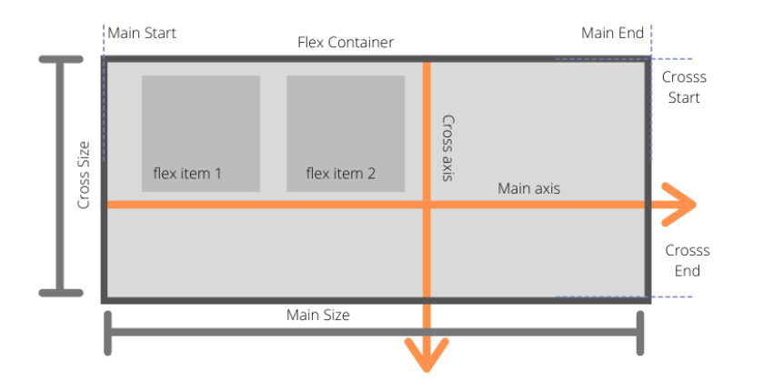
Flexbox is divided into two-axis main axis and cross axis.
In normal layout, when we are using display inline or inline-block, it goes from left to right only
- main-axis: This is the default axis where items are laid out by default. It’s not necessarily horizontal always; it can be vertical depending upon flex-direction
- Main start/Main-end: Items will be placed from main-start to main-end
- Main size: The width or height of the container depending upon flex-direction
- Cross-axis: Cross axis is perpendicular to the main axis.
- Cross-start/Cross-end: Items will be laid out started from cross-start to cross-end
- Cross-size: The width or height of a flex item, whichever is in the cross dimension, is the item’s cross size. The cross size property is whichever of ‘width’ or ‘height’ that is in the cross dimension.
Before starting with the Flexbox properties, we should understand which properties are meant for flex container and flex items.
Flexbox Container Properties
- display
- flex-direction
- flex-wrap
- justify-contents
- align-items
- align-contents
Flexbox Item Properties
- order
- flex-grow
- flex-shrink
- flex-basis
- flex
- align-self
Flexbox Container Properties
Display
As we know display property have the number of value like inline, block, inline-block, etc. But if we are giving value as flex then we are turning on flexbox context
.container { display: flex }flex-direction
flex-direction decides that how items will be laid out on main-axis horizontally or vertically
flex-direction: row|row-reverse|column|column-reverse|initial|inherit;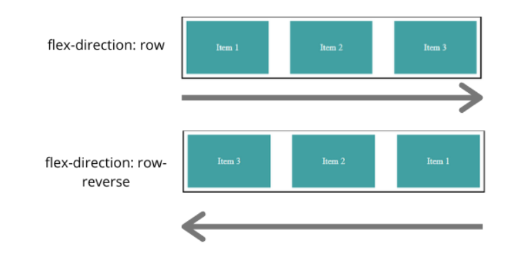
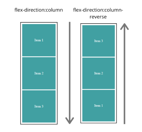
Above are the possible values for flex-direction property
- row: Row is by default value for flex-direction where item will be placed from left to right
- row-reverse: Items will be placed from right to left
- column: Items will be placed vertically top to bottom
- column-reverse: Items will be placed bottom to top
- initial: It set’s value to the default
- inherit: Inherit the value from the parent
flex-wrap
flex-wrap controls the behavior that items will move into the next line if the container width is less than the total item width. Default value: nowrap
flex-wrap: nowrap | wrap | wrap-reverse;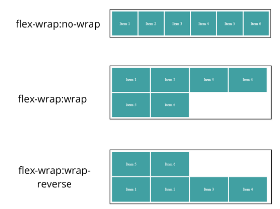
no-wrap: fit into the one line by adjusting the width of the item
- wrap: item will be laid down to next line from top to bottom
- wrap-reverse: item will be laid down to next line from bottom to top
flex-flow
flex-flow is shorthand for flex-direction and flex-wrap. Default value: row no-wrap
flex-flow: <flex-direction> | <flex-wrap>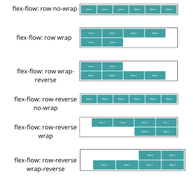
Above, we saw an example of flex-flow where flex-direction is row. You can do the same for flex-direction column just consider the above vertically.
justify-content
justify-content is used to align items on the main-axis. Its container property so it will align all child items to the particular position like to the center, start or end or giving space between them. Default value: flex-start
justify-content: flex-start|flex-end|center|space-between|space-around|initial|inherit;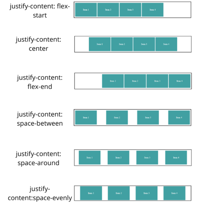
flex-start – Align items to the start of the container depending upon flex-direction
.container { flex-direction: row-reverse justify-content: flex-start; }As you can see above, flex-start started from the right side, not from the writing mode direction
- center: Align items to the center
- flex-end: Align items to the end of the container as per flex-direction
- space-around: Gives space around the items by adjusting width
- space-between: Gives space between the items not at the start and end of the container
- space-evenly: Gives an equal amount of space around the item
- start: Align items to the start of the container as per writing mode direction
- end: Align items to the end of the container as per writing mode direction
align-items
align-items property is used to align items in respective of cross-axis like we have justify-content for main-axis
align-items: stretch|center|flex-start|flex-end|baseline|initial|inherit;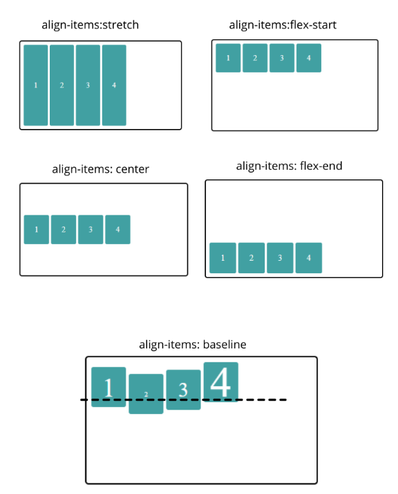
- stretch: occupies the full height of the container if height to the items not given externally
- flex-start: align-items to the start of the container in consideration with cross-axis
- center: align-items to the center in consideration with cross-axis
- flex-end: align-items to the end in consideration with cross-axis
- baseline: align-items as per baseline of the item content in consideration with cross-axis
align-content
align-content is used to align rows not items in respective of cross-axis. You might get confused about the difference between align-items and align content. Let’ s see an example by comparing align-items and align-content.
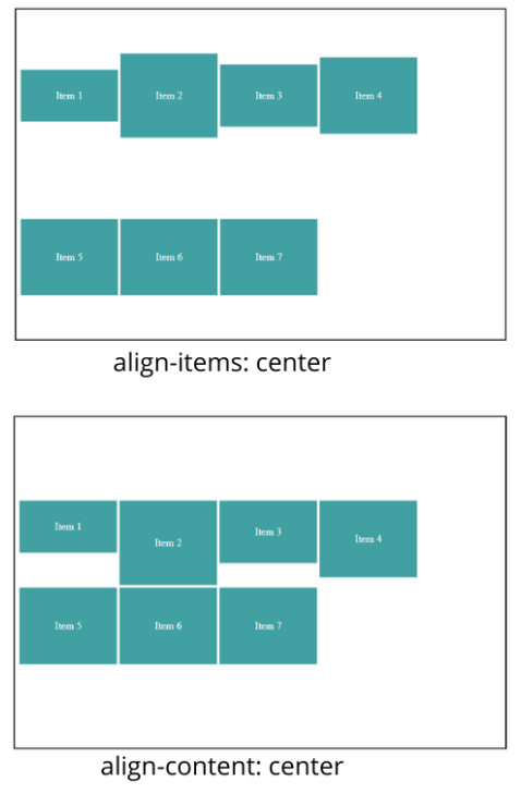
As you can see in the above align-items, center align-items to center in respective of cross-axis and align-content align rows to the center in respective of cross-axis.
We have taken an example with two rows because align-content does not affect single line
Flex Item Properties
Using order property, it’s possible to re-arrange the natural order of container items.
Default value: 0
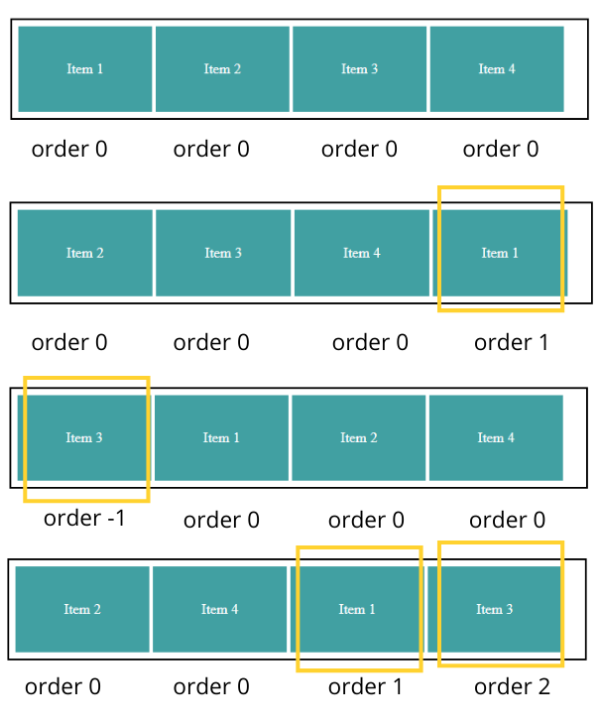
The first diagram shows default behavior where all items have order value 0.
In the second diagram, item 1 (highlighted one) moves to last because its order value is greater than the remaining three.
In the third diagram, item 3 moves to the first position because it has order value -1, which is smaller than the other three items.
In the fourth diagram, item 1 and item 3 move to last because their order value is greater than others.
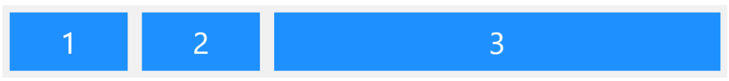
flex-grow
This defines the ability for a flex item to grow if necessary. It accepts a unitless value that serves as a proportion. It dictates what amount of the available space inside the flex container the item should take up.
If all items have flex-grow set to 1, the remaining space in the container will be distributed equally to all children. If one of the children has a value of 2, the remaining space would take up twice as much space as the others (or it will try to, at least).
flex-shrink
flex-shrink property allow item to shrink as container size decreases. Default value: 0
If all items in the container have value as 1, then all the items will shrink in equal ratio.
And all items have value as 1 except one item, which has value 2, then this item will shrink to half the other items.
For example:
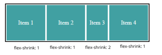
As you can see above in the given flex-shrink: 2 to the third element shrink twice as much as other elements.
Negative values are not allowed.
flex-basis
flex-basis is nothing but the min-width for the container items in flexbox context. Default value: Auto
For example, if we haven’t provided value to the flex-basis property, then its value will be auto by default, then flexbox items will take the width, which is equal to the content width.
flex
flex is shorthand for flex-grow, flex-shrink, and flex-basis. Default value: 0 1 auto
flex-grow: <flex-grow> <flex-shrink> <flex-basis>