

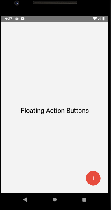
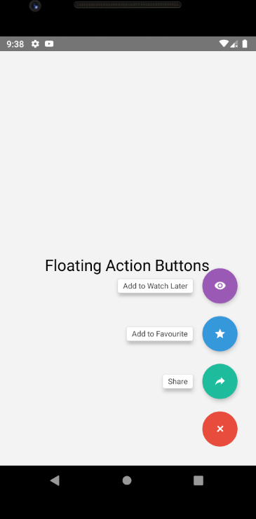
Floating Action Button with Multiple Option
In this section we are going to create a floating button with multiple option. To make an Action Button in React Native we are going to use ActionButton component provided by react-native-action-button.
To make an Action Button we will use ActionButton component and for that, we have to install react-native-action-button dependency
npm install react-native-action-button --save- For the icons, we will install react-native-vector-icons
npm install react-native-vector-icons --saveAfter that we have to link this dependency.
react-native link react-native-vector-iconsApp.js
import React, { Component } from 'react';
import { StyleSheet, View, Text } from 'react-native';
import ActionButton from 'react-native-action-button';
import Icon from 'react-native-vector-icons/Ionicons';

export default class App extends Component {
  render() {
    return (
      <View
        style={{
          flex: 1,
          backgroundColor: '#f3f3f3',
          justifyContent: 'center',
          alignContent: 'center',
          padding:20
        }}>
        <Text style={{ textAlign: 'center', marginTop: 20, fontSize: 25 }}>
          Floating Action Buttons
        </Text>
        <ActionButton buttonColor="rgba(231,76,60,1)">
          <ActionButton.Item
            buttonColor="#9b59b6"
            title="Add to Watch Later"
            onPress={() => alert('Added to watch later')}>
            <Icon name="md-eye" style={styles.actionButtonIcon} />
          </ActionButton.Item>
          <ActionButton.Item
            buttonColor="#3498db"
            title="Add to Favourite"
            onPress={() => alert('Added to favourite')}>
            <Icon name="md-star" style={styles.actionButtonIcon} />
          </ActionButton.Item>
          <ActionButton.Item
            buttonColor="#1abc9c"
            title="Share"
            onPress={() => alert('Share Post')}>
            <Icon name="md-share-alt" style={styles.actionButtonIcon} />
          </ActionButton.Item>
        </ActionButton>
      </View>
    );
  }
}

const styles = StyleSheet.create({
  actionButtonIcon: {
    fontSize: 20,
    height: 22,
    color: 'white',
  },
});
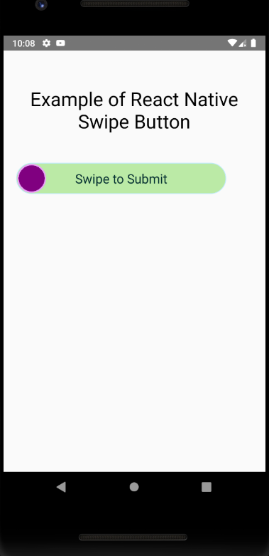
Swipe Button
In this section we see how we implement swipe button in react native application. we are using SwipeButton component provided by rn-swipe-button library.
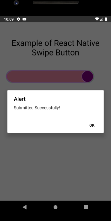
In this example, we will make a swipeable button that has success threshold =70 and has a custom title with custom properties like background color, border color, thumb icon background color, thumb icon border-color. After swiping the button it will trigger onSwipeSuccess where you can add your to-do (We are showing alert only). So let’s get started with the example. For this install the dependency

npm install rn-swipe-button --saveComponent properties
containerStyles: PropTypes.object,

disabled: PropTypes.bool,

disabledRailBackgroundColor: PropTypes.string,

disabledThumbIconBackgroundColor: PropTypes.string,

disabledThumbIconBorderColor: PropTypes.string,

enableRightToLeftSwipe: PropTypes.bool,

height: PropTypes.number,

onSwipeFail: PropTypes.func,

onSwipeStart: PropTypes.func,

onSwipeSuccess: PropTypes.func,

railBackgroundColor: PropTypes.string,

railBorderColor: PropTypes.string,

railFillBackgroundColor: PropTypes.string,

railFillBorderColor: PropTypes.string,

railStyles: PropTypes.object,

resetAfterSuccessAnimDuration: PropTypes.number,

screenReaderEnabled: PropTypes.bool,

swipeSuccessThreshold: PropTypes.number, // Ex: 70. Swipping 70% will be considered as successful swipe

shouldResetAfterSuccess: PropTypes.bool,

thumbIconBackgroundColor: PropTypes.string,

thumbIconBorderColor: PropTypes.string,

thumbIconComponent: PropTypes.node,

thumbIconImageSource: PropTypes.oneOfType([
  PropTypes.string,
  PropTypes.number,
]),

thumbIconStyles: PropTypes.object,

title: PropTypes.string,

titleColor: PropTypes.string,

titleFontSize: PropTypes.number,

titleStyles: PropTypes.object,

width: PropTypes.number,
App.js
import React, {Component} from 'react';
import { SafeAreaView, View, Text, ToastAndroid } from 'react-native';
import SwipeButton from 'rn-swipe-button';

export default class App extends Component {
  render() {
    return (
      <SafeAreaView>
        <View style={{ padding: 15 }}>
          <Text
            style={{
              fontSize: 30,
              marginVertical: 40,
              textAlign: 'center'
            }}>
            Example of React Native Swipe Button
          </Text>
          <SwipeButton
            disabled={false}
            swipeSuccessThreshold={70}
            height={45}
            width={330}
            title="Swipe to Submit"
            onSwipeSuccess={() => {
              alert('Submitted Successfully!');
            }}
            railFillBackgroundColor="#e688a1" //(Optional)
            railFillBorderColor="#e688ff" //(Optional)
            thumbIconBackgroundColor="#ed9a73" //(Optional)
            thumbIconBorderColor="#ed9aff" //(Optional)
            railBackgroundColor="#bbeaa6" //(Optional)
            railBorderColor="#bbeaff" //(Optional)
          />
        </View>
      </SafeAreaView>
    );
  }
}