

This dimension class helps to detect android or ios device screen width and height in very easy way. First thing first, import Dimension class from the “react-native” package.
import {Dimensions } from "react-native";useWindowDimensions is the preferred API for React components. Unlike Dimensions, it updates as the window’s dimensions update. This works nicely with the React paradigm. You can get the application window’s width and height using the following code:
const windowWidth = Dimensions.get('window').width;
const windowHeight = Dimensions.get('window').height;
Although dimensions are available immediately, they may change (e.g due to device rotation, foldable devices etc) so any rendering logic or styles that depend on these constants should try to call this function on every render, rather than caching the value (for example, using inline styles rather than setting a value in a StyleSheet).
If you are targeting foldable devices or devices which can change the screen size or app window size, you can use the event listener available in the Dimensions module as shown in the below example.
import React, { useState, useEffect } from "react";
import { View, StyleSheet, Text, Dimensions } from "react-native";
const window = Dimensions.get("window");
const screen = Dimensions.get("screen");
export default function App() {
const [dimensions, setDimensions] = useState({ window, screen });
const onChange = ({ window, screen }) => {
setDimensions({ window, screen });
};
useEffect(() => {
Dimensions.addEventListener("change", onChange);
return () => {
Dimensions.removeEventListener("change", onChange);
};
});
return (
<View style={styles.container}>
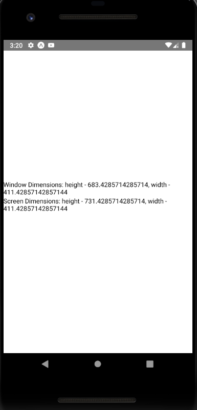
<Text>{`Window Dimensions: height - ${dimensions.window.height}, width - ${dimensions.window.width}`}</Text>
<Text>{`Screen Dimensions: height - ${dimensions.screen.height}, width - ${dimensions.screen.width}`}</Text>
</View>
);
}
const styles = StyleSheet.create({
container: {
flex: 1,
justifyContent: "center",
alignItems: "center"
}
});
Methods
addEventListener()
static addEventListener(type, handler)
Add an event handler. Supported events:
change: Fires when a property within theDimensionsobject changes. The argument to the event handler is an object withwindowandscreenproperties whose values are the same as the return values ofDimensions.get('window')andDimensions.get('screen'), respectively.window– Size of the visible Application windowscreen– Size of the device’s screen
get()
static get(dim)
Initial dimensions are set before runApplication is called so they should be available before any other require’s are run, but may be updated later.

Example: const {height, width} = Dimensions.get('window');