React Native – Layout and Flexbox

A component can specify the layout of its children using the Flexbox algorithm. Flexbox is designed to provide a consistent layout on different screen sizes.
You will normally use a combination of flexDirection, alignItems, and justifyContent to achieve the right layout.
To accommodate different screen sizes, React Native offers Flexbox support.
Layout
| Property | Values | Description |
| flexDirection | ‘column’, ‘row’ | Used to specify if elements will be aligned vertically or horizontally. |
| justifyContent | ‘center’, ‘flex-start’, ‘flex-end’, ‘space-around’, ‘space-between’ | Used to determine how should elements be distributed inside the container. |
| alignItems | ‘center’, ‘flex-start’, ‘flex-end’, ‘stretched’ | Used to determine how should elements be distributed inside the container along the secondary axis (opposite of flexDirection) |
Flexbox works the same way in React Native as it does in CSS on the web, with a few exceptions. The defaults are different, with flexDirection defaulting to column instead of row, and the flex parameter only supporting a single number.
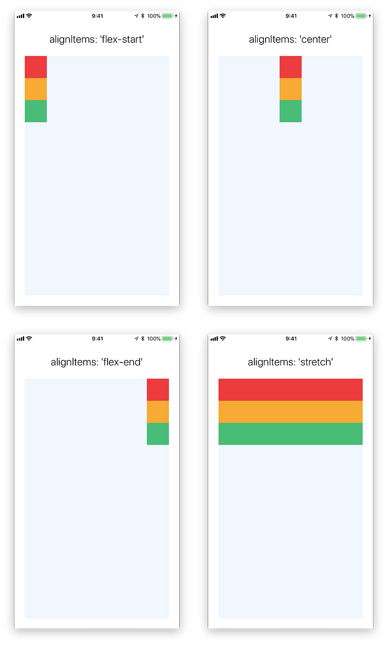
For stretch to have an effect, children must not have a fixed dimension along the secondary axis. In the following example, setting alignItems: stretch does nothing until the width: 50 is removed from the children.
Flex
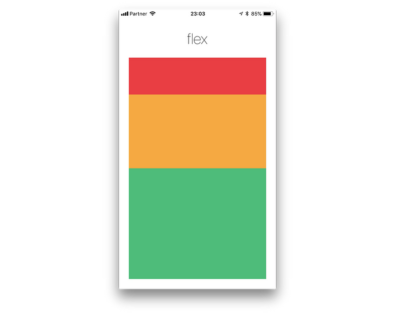
Flex will define how your items are going to “fill” over the available space along your main axis. Space will be divided according to each element’s flex property.
In the following example, the red, yellow, and green views are all children in the container view that has flex: 1 set. The red view uses flex: 1 , the yellow view uses flex: 2, and the green view uses flex: 3 . 1+2+3 = 6, which means that the red view will get 1/6 of the space, the yellow 2/6 of the space, and the green 3/6 of the space.
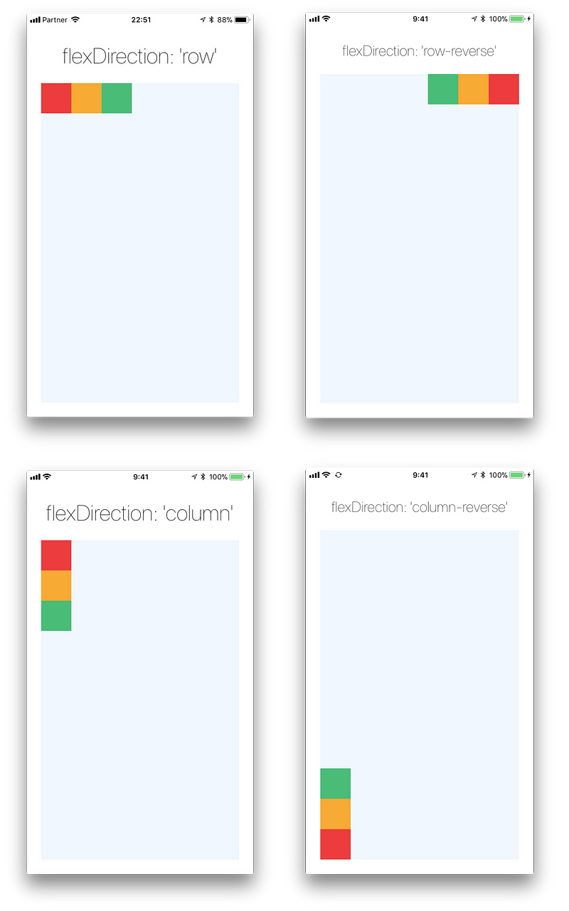
FlexDirection:
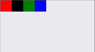
First create a component and take four boxes to arrange in that component. Let’s Imagine that component is a parent and four boxes are children. First thing we have to deside that direction of arraging children in parent which is main axis direction. This is determined by flexbox property called flexDirection.
flexDirection: ‘row’ | ‘column
flexDirection have two values ‘row’ and ‘column’. Defalut value is ‘column’. If we choose ‘row’ which means main axis direction row, the children(four boxes) are arranged horizontally, or If we choose ‘column’ children are arranged vertically in the direction of column in parent.
import React, { Component } from 'react';
import { View } from 'react-native';

export default class Example extends Component {
  render() {
    return (
      <View style={{ flexDirection: 'row' }}>
        <View style={{ height: 50, width: 50, backgroundColor: 'red' }} />
        <View style={{ height: 50, width: 50, backgroundColor: 'blue' }} />
        <View style={{ height: 50, width: 50, backgroundColor: 'green' }} />
        <View style={{ height: 50, width: 50, backgroundColor: 'black' }} />
      </View>
    );
  }
}
Justify Content
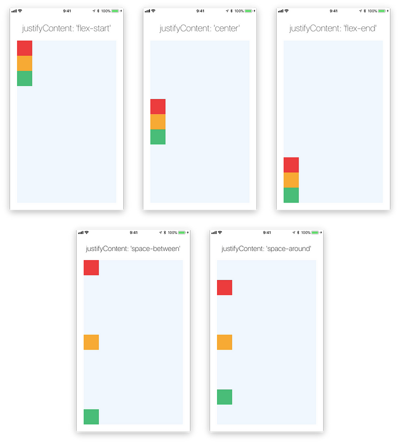
JustifyContent describes how to align children within the main axis of their container. For example, you can use this property to center a child horizontally within a container with flexDirection set to row or vertically within a container with flexDirection set to column.
- flex-start(default value) Align children of a container to the start of the container’s main axis.
- flex-end Align children of a container to the end of the container’s main axis.
- center Align children of a container in the center of the container’s main axis.
- space-between Evenly space off children across the container’s main axis, distributing the remaining space between the children.
- space-around Evenly space off children across the container’s main axis, distributing the remaining space around the children. Compared to space-between, using space-around will result in space being distributed to the beginning of the first child and end of the last child.
- space-evenly Evenly distribute children within the alignment container along the main axis. The spacing between each pair of adjacent items, the main-start edge and the first item, and the main-end edge and the last item, are all exactly the same.
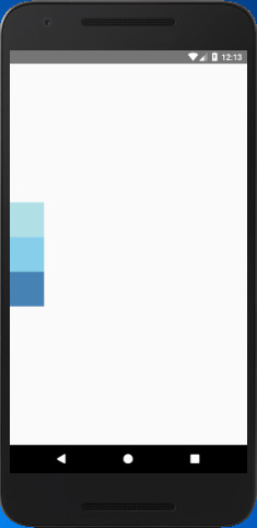
import React, { Component } from 'react';
import { StyleSheet,View } from 'react-native';

export default class JustifyContentBasics extends Component {
    render() {
        return (
            <View style={styles.container}>
                <View style={styles.powderblue} />
                <View style={styles.skyblue} />
                <View style={styles.steelblue} />
            </View>
        );
    }
}
const styles = StyleSheet.create({
    container:{
        flex: 1,
        flexDirection: 'column', // set elements horizontally`.
        justifyContent: 'center',

    },
    powderblue:{
        width: 60,
        height: 60,
        backgroundColor: 'powderblue'
    },
    skyblue:{
        width: 60,
        height: 60,
        backgroundColor: 'skyblue',
    },
    steelblue:{
        width: 60,
        height: 60,
        backgroundColor: 'steelblue',
    }
})
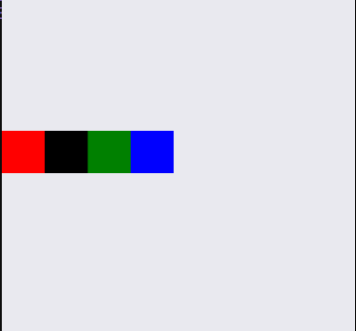
alignItems:
alignItems: ‘flex-start’, ‘center’, ‘flex-end’, ‘stretch’
Here our main axis direction is ‘row’(Horizontal), so alignItems property will arrange the children along with opposite direction of main axis(Vertical).
- flex-start: It will align children at start/top of the parent.
- flex-end: It will align children at end/bottom of the parent.
- center: It will align children at the center of the parent.
- stretch: It will stretch the children across the opposite of main axis until it reaches ends of the parent. It will apply only when opposite of main axis don’t have fixed dimensions.
import React, { Component } from 'react';
import { View } from 'react-native';

export default class Example extends Component {
  render() {
    return (
      <View style={{ flexDirection: 'row', alignItems: 'center' }}>
        <View style={{ height: 50, width: 50, backgroundColor: 'red' }} />
        <View style={{ height: 50, width: 50, backgroundColor: 'black' }} />
        <View style={{ height: 50, width: 50, backgroundColor: 'green' }} />
        <View style={{ height: 50, width: 50, backgroundColor: 'blue' }} />
      </View>
    );
  }
}