| Props | Description |
|---|---|
| animating | Option to show the indicator (bydefault it is true) or hide it (false). |
| size | Set the size of indicator (‘small’,’large’, number). The default size is small. Number format support only in android. |
| color | Set the foreground color of the spinner (default is gray). |
| hidesWhenStopped | It provides an option to show or hide the indicator when there is no animating (true by default). |
Example
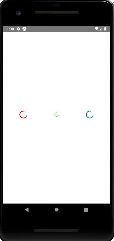
In this example, the animating property set the activity indicator to true, and it is visible on the screen. When the component mounts, the animated activity indicator will be closed after six seconds using the closeActivityIndicator() method.
import React,{Component} from 'react';
import { Picker, View, StyleSheet, ActivityIndicator } from 'react-native';
export default class ActivityIndicatorDemo extends Component {
  state = { animating: true }
  closeActivityIndicator = () => setTimeout(() => this.setState({
    animating: false
  }), 6000)
  componentDidMount = () => this.closeActivityIndicator()
  render() {
    const animating = this.state.animating
    return (
      <View style={[styles.container, styles.horizontal]} >
        <ActivityIndicator animating={animating} size="large" color="#ff0000" />
        <ActivityIndicator size="small" color="#44ff00" />
        <ActivityIndicator size="large" color="#rtwrw" />
      </View>
    )
  }
}

const styles = StyleSheet.create({
  container: {
    flex: 1,
    justifyContent: 'center'
  },
  horizontal: {
    flexDirection: 'row',
    justifyContent: 'space-around',
    padding: 10
  }
});


