In this section I am going to explain about React Native Buttons.
Buttons are touchable elements used to interact with the screen. They may display text, icons, or both. Buttons can be styled with several props to look a specific way.
A basic button component that should render nicely on any platform. Supports a minimal level of customization. If this button doesn’t look right for your app, you can build your own button using TouchableOpacity or TouchableNativeFeedback.
Props of Button
| Prop | Type | Required | Description |
|---|---|---|---|
| onPress | function | yes | Call the handler when user clicks the button. |
| title | string | yes | Display the text inside the button. |
| accessibilityLabel | string | no | Display the text for blindness accessibility features. |
| color | Color | no | Set the background color of the Android button or set the color of iOS text. |
| disabled | bool | no | It disables all interactions for this component, if true. |
| textID | string | no | Used to locate this view in end-to-end tests. |
| hasTVPreferredFocus | bool | no | It preferred TV focus work only for Apple TV. |
For importing Button component in our application we use
import { Button } from 'react-native'import React from 'react';
import { StyleSheet, Button, View, SafeAreaView, Text, Alert } from 'react-native';
import Constants from 'expo-constants';
function Separator() {
return <View style={styles.separator} />;
}
export default function App() {
return (
<SafeAreaView style={styles.container}>
<View>
<Text style={styles.title}>
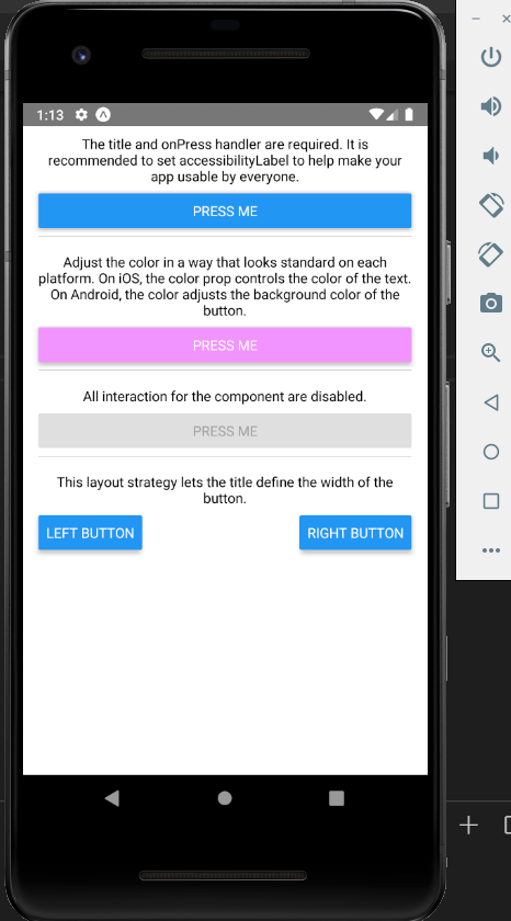
The title and onPress handler are required. It is recommended to set
accessibilityLabel to help make your app usable by everyone.
</Text>
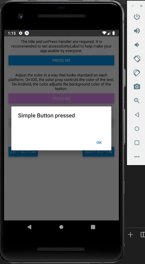
<Button
title="Press me"
onPress={() => Alert.alert('Simple Button pressed')}
/>
</View>
<Separator />
<View>
<Text style={styles.title}>
Adjust the color in a way that looks standard on each platform. On
iOS, the color prop controls the color of the text. On Android, the
color adjusts the background color of the button.
</Text>
<Button
title="Press me"
color="#f194ff"
onPress={() => Alert.alert('Button with adjusted color pressed')}
/>
</View>
<Separator />
<View>
<Text style={styles.title}>
All interaction for the component are disabled.
</Text>
<Button
title="Press me"
disabled
onPress={() => Alert.alert('Cannot press this one')}
/>
</View>
<Separator />
<View>
<Text style={styles.title}>
This layout strategy lets the title define the width of the button.
</Text>
<View style={styles.fixToText}>
<Button
title="Left button"
onPress={() => Alert.alert('Left button pressed')}
/>
<Button
title="Right button"
onPress={() => Alert.alert('Right button pressed')}
/>
</View>
</View>
</SafeAreaView>
);
}
const styles = StyleSheet.create({
container: {
flex: 1,
marginTop: Constants.statusBarHeight,
marginHorizontal: 16,
},
title: {
textAlign: 'center',
marginVertical: 8,
},
fixToText: {
flexDirection: 'row',
justifyContent: 'space-between',
},
separator: {
marginVertical: 8,
borderBottomColor: '#737373',
borderBottomWidth: StyleSheet.hairlineWidth,
},
});
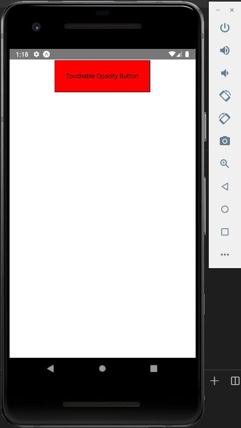
Touchable Opacity
This element will change the opacity of an element when touched.
import React from 'react'
import { TouchableOpacity, StyleSheet, View, Text } from 'react-native'

const App = () => {
   return (
      <View style = {styles.container}>
         <TouchableOpacity>
            <Text style = {styles.text}>
               Touchable Opacity Button
            </Text>
         </TouchableOpacity>
      </View>
   )
}
export default App

const styles = StyleSheet.create ({
   container: {
      alignItems: 'center',
   },
   text: {
      borderWidth: 1,
      padding: 25,
      borderColor: 'black',
      backgroundColor: 'red',
      marginTop:25
   }
})
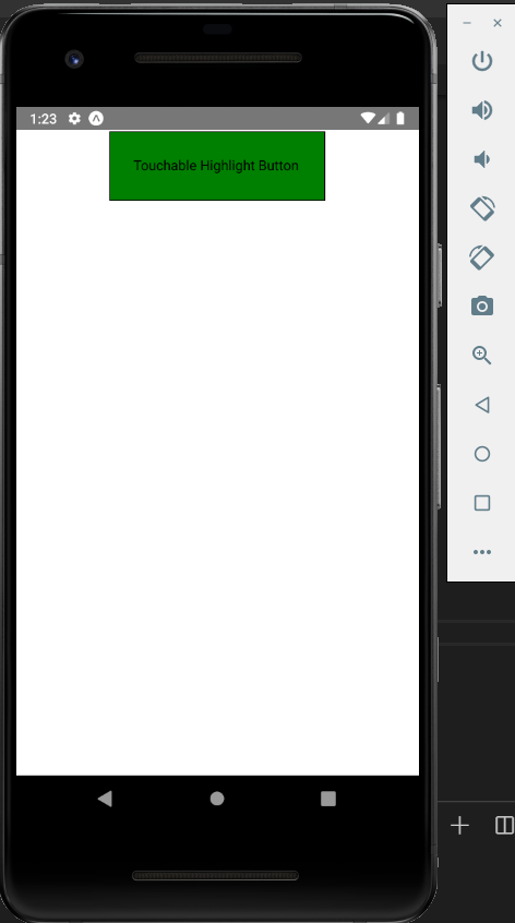
Touchable Highlight
When a user presses the element, it will get darker and the underlying color will show through.
import React from 'react'
import { View, TouchableHighlight, Text, StyleSheet } from 'react-native'

const App = (props) => {
   return (
      <View style = {styles.container}>
         <TouchableHighlight>
            <Text style = {styles.text}>
            Touchable Highlight Button
            </Text>
         </TouchableHighlight>
      </View>
   )
}
export default App

const styles = StyleSheet.create ({
   container: {
      alignItems: 'center',
   },
   text: {
      borderWidth: 1,
      padding: 25,
      borderColor: 'black',
      backgroundColor: 'green',
      marginTop:25
   }
})
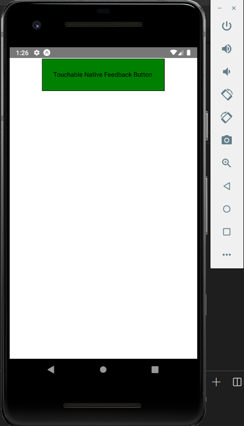
Touchable Native Feedback
This will simulate ink animation when the element is pressed.
import React from 'react'
import { View, TouchableNativeFeedback, Text, StyleSheet } from 'react-native'

const App = (props) => {
   return (
      <View style = {styles.container}>
         <TouchableNativeFeedback>
            <Text style = {styles.text}>
            Touchable Native Feedback Button
            </Text>
         </TouchableNativeFeedback>
      </View>
   )
}
export default App

const styles = StyleSheet.create ({
   container: {
      alignItems: 'center',
   },
   text: {
      borderWidth: 1,
      padding: 25,
      borderColor: 'black',
      backgroundColor: 'green',
      marginTop:25
   }
})