
The Modal component is a basic way to present content above an enclosing view.
There are three different types of options (slide, fade and none) available in a modal that decides how the modal will show inside the react native app.
The Modal shows above the screen covers all the application area.
To Import Modal in Code
import { Modal } from 'react-native'Render Using
<Modal>All views inside the modal</Modal>| Props | Description |
|---|---|
| visible | This prop determines whether your modal is visible. |
| supportedOritentions | It allow for rotating the modal in any of the specified orientations (portrait, portrait-upside-down, landscape, landscape-left, landscape-right). |
| onRequestClose | This is a callback prop which is called when the user taps on the hardware back button on Android or the menu button on Apple TV. |
| onShow | This allows passing a function which will show when the modal once visible. |
| transparent | It determines whether the modal will cover the entire view. Setting it to “true” renders the modal over the transparent background. |
| animationType | It controls how the modal animates. There are three types of animated props available: slide: It slides the modal from the bottom. fade: It fades into the view. none: It appears the model without any animation. |
| hardwareAccelerated | It controls whether to force hardware acceleration for the underlying window. |
| onDismiss | This prop passes a function that will be called once the modal has been dismissed. |
| onOrientationChange | This props is called when the orientation changes while the modal is being displayed. The type of orientation is “portrait” or “landscape”. |
| presentationStyle | It controls the appearance of a model (fullScreen, pageSheet, fromSheet, overFullScreen) generally on the large devices. |
| animated | This prop is deprecated. Use the animatedType prop instead, which is discussed above. |
import React, { Component } from 'react';
import { Modal, Text, TouchableHighlight, View, StyleSheet} from 'react-native'
class ModalExample extends Component {
state = {
modalVisible: false,
}
toggleModal(visible) {
this.setState({ modalVisible: visible });
}
render() {
return (
<View style = {styles.container}>
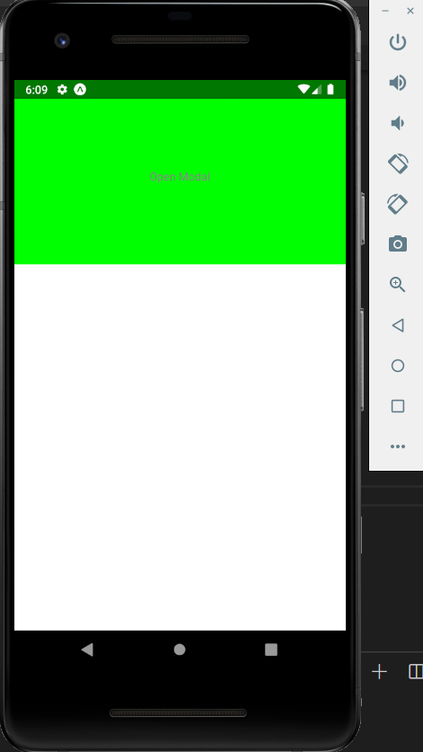
<Modal animationType = {"slide"} transparent = {false}
visible = {this.state.modalVisible}
onRequestClose = {() => { console.log("React Native Modal has been closed.") } }>
<View style = {styles.modal}>
<Text style = {styles.text}>React Native Modal is open!</Text>
<TouchableHighlight onPress = {() => {
this.toggleModal(!this.state.modalVisible)}}>
<Text style = {styles.text}>Close Modal</Text>
</TouchableHighlight>
</View>
</Modal>
<TouchableHighlight onPress = {() => {this.toggleModal(true)}}>
<Text style = {styles.text}>Open Modal</Text>
</TouchableHighlight>
</View>
)
}
}
export default ModalExample
const styles = StyleSheet.create ({
container: {
alignItems: 'center',
backgroundColor: '#ede3f2',
padding: 100
},
modal: {
flex: 1,
alignItems: 'center',
backgroundColor: '#f7021a',
padding: 100
},
text: {
color: '#3f2949',
marginTop: 10
}
})

The onRequestClose callback is called when the user taps the hardware back button on Android or the menu button on Apple TV. Because of this required prop, be aware that BackHandler events will not be emitted as long as the modal is open.