In this tutorial we are going to learn How we can use popup dialogue in our React Native Application and for that I am going to use react-native-popup-dialog.
First we have install dependency for the popup dialog.
npm install react-native-popup-dialog --saveExample
import Dialog, { DialogContent } from 'react-native-popup-dialog';
import { Button } from 'react-native'

<View style={styles.container}>
  <Button
    title="Show Dialog"
    onPress={() => {
      this.setState({ visible: true });
    }}
  />
  <Dialog
    visible={this.state.visible}
    onTouchOutside={() => {
      this.setState({ visible: false });
    }}
  >
    <DialogContent>
      {...}
    </DialogContent>
  </Dialog>
</View>import Dialog, { SlideAnimation, DialogContent } from 'react-native-popup-dialog';
<View style={styles.container}>
<Dialog
visible={this.state.visible}
dialogAnimation={new SlideAnimation({
slideFrom: 'bottom',
})}
>
<DialogContent>
{...}
</DialogContent>
</Dialog>
</View>import Dialog, { DialogTitle, DialogContent } from 'react-native-popup-dialog';
<View style={styles.container}>
<Dialog
visible={this.state.visible}
dialogTitle={<DialogTitle title="Dialog Title" />}
>
<DialogContent>
{...}
</DialogContent>
</Dialog>
</View>import Dialog, { DialogFooter, DialogButton, DialogContent } from 'react-native-popup-dialog';
<View style={styles.container}>
<Dialog
visible={this.state.visible}
footer={
<DialogFooter>
<DialogButton
text="CANCEL"
onPress={() => {}}
/>
<DialogButton
text="OK"
onPress={() => {}}
/>
</DialogFooter>
}
>
<DialogContent>
{...}
</DialogContent>
</Dialog>
</View>Prop Type Default Note visiblebooleanfalseroundedbooleantrueuseNativeDriverbooleantruechildrenanydialogTitle?React ElementYou can pass a DialogTitle component or pass a View for customizing titlebar width?NumberYour device width The Width of Dialog, you can use fixed width or use percentage. For example 0.5 it means 50% height?Number300 The Height of Dialog, you can use fixed height or use percentage. For example 0.5 it means 50% dialogAnimation?FadeAnimationanimation for dialog dialogStyle?anycontainerStyle?anynullFor example: { zIndex: 10, elevation: 10 } animationDuration?Number200overlayPointerEvents?StringAvailable option: auto, none overlayBackgroundColor?String#000overlayOpacity?Number0.5hasOverlay?BooleantrueonShow?FunctionYou can pass shown function as a callback function, will call the function when dialog shown onDismiss?FunctionYou can pass onDismiss function as a callback function, will call the function when dialog dismissed onTouchOutside?Function() => {}onHardwareBackPress?Function() => trueHandle hardware button presses footer?React Elementnullfor example: <View><Button text="DISMISS" align="center" onPress={() => {}}/></View>
Prop Type Default Note titleStringstyle?anynulltextStyle?anynullalign?StringcenterAvailable option: left, center, right hasTitleBar?Booltrue
Prop Type Default Note childrenanystyle?anynull
Prop Type Default Note childrenDialogButtonbordered?Booleantruestyle?anynull
Prop Type Default Note textStringonPressFunctionalign?StringcenterAvailable option: left, center, right style?anynulltextStyle?anynullactiveOpacity?Number0.6disabled?Booleanfalsebordered?Booleanfalse
Prop Type Default Note visibleBooleanopacityNumber0.5onPress?FunctionbackgroundColor?string#000animationDuration?Number200pointerEvents?StringnullAvailable option: auto, none useNativeDriver?Booleantrue
App.js Code
import React, { Component } from 'react';
import { Button, View, Text, StyleSheet } from 'react-native';
import Dialog, {
DialogTitle,
DialogContent,
DialogFooter,
DialogButton,
SlideAnimation,
ScaleAnimation,
} from 'react-native-popup-dialog';
export default class App extends Component {
state = {
defaultAnimationDialog: false,
scaleAnimationDialog: false,
slideAnimationDialog: false,
};
render() {
return (
<View style={{ flex: 1 }}>
<View style={styles.container}>
<Button
title="Default Animation Dialog"
onPress={() => {
this.setState({
defaultAnimationDialog: true,
});
}}
/>
<Button
title="Scale Animation Dialog"
onPress={() => {
this.setState({
scaleAnimationDialog: true,
});
}}
/>
<Button
title="Slide Animation Dialog"
onPress={() => {
this.setState({
slideAnimationDialog: true,
});
}}
/>
</View>
<Dialog
onDismiss={() => {
this.setState({ defaultAnimationDialog: false });
}}
width={0.9}
visible={this.state.defaultAnimationDialog}
rounded
actionsBordered
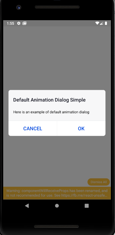
dialogTitle={
<DialogTitle
title="Default Animation Dialog Simple"
style={{
backgroundColor: '#F7F7F8',
}}
hasTitleBar={false}
align="left"
/>
}
footer={
<DialogFooter>
<DialogButton
text="CANCEL"
bordered
onPress={() => {
this.setState({ defaultAnimationDialog: false });
}}
key="button-1"
/>
<DialogButton
text="OK"
bordered
onPress={() => {
this.setState({ defaultAnimationDialog: false });
}}
key="button-2"
/>
</DialogFooter>
}>
<DialogContent
style={{
backgroundColor: '#F7F7F8',
}}>
<Text>Here is an example of default animation dialog</Text>
</DialogContent>
</Dialog>
<Dialog
onTouchOutside={() => {
this.setState({ scaleAnimationDialog: false });
}}
width={0.9}
visible={this.state.scaleAnimationDialog}
dialogAnimation={new ScaleAnimation()}
onHardwareBackPress={() => {
console.log('onHardwareBackPress');
this.setState({ scaleAnimationDialog: false });
return true;
}}
dialogTitle={
<DialogTitle
title="Scale Animation Dialog Sample"
hasTitleBar={false}
/>
}
actions={[
<DialogButton
text="DISMISS"
onPress={() => {
this.setState({ scaleAnimationDialog: false });
}}
key="button-1"
/>,
]}>
<DialogContent>
<View>
<Text>
Here is an example of scale animation dialog. Close using back
button press
</Text>
<Button
title="Close"
onPress={() => {
this.setState({ scaleAnimationDialog: false });
}}
key="button-1"
/>
</View>
</DialogContent>
</Dialog>
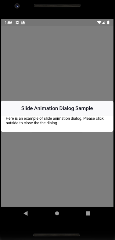
<Dialog
onDismiss={() => {
this.setState({ slideAnimationDialog: false });
}}
onTouchOutside={() => {
this.setState({ slideAnimationDialog: false });
}}
visible={this.state.slideAnimationDialog}
dialogTitle={<DialogTitle title="Slide Animation Dialog Sample" />}
dialogAnimation={new SlideAnimation({ slideFrom: 'bottom' })}>
<DialogContent>
<Text>
Here is an example of slide animation dialog. Please click outside
to close the the dialog.
</Text>
</DialogContent>
</Dialog>
</View>
);
}
}
const styles = StyleSheet.create({
container: {
flex: 1,
alignItems: 'center',
justifyContent: 'center',
},
});
Copy URL
URL Copied


