

React Native Picker is a component for selection between different choices same as a Dropdown. React Native Picker is component which is used to select an item from the multiple choices.
To Import Picker in Code
import { Picker } from 'react-native'Render Using
<Picker>
    <Picker.Item label = "display member" value = "value member" />
</Picker>| Prop | Description |
|---|---|
| onValueChange( itemValue, itemPosition) | It is a callback prop and called when an item is selected. It takes two parameters (itemValue: the item (value) which is selected, itemPosition: the position (index) of a selected item). |
| selectedValue | Returns the selected value. |
| style | It is a picket style type. |
| testID | It is used to locate this view in end-to-end tests. |
| enabled | It is a Boolean prop which makes picker disable when set to false. If it is set to false, the user cannot be able to make a selection. |
| mode | On Android, it specifies how to display the selections items when the users click on the picker. It has the “dialog” and “dropdown” properties. The dialog is default mode and shows as a modal dialog. The dropdown displays the picker as dropdown anchor view. |
| prompt | It is used in Android with dialog mode as the title of the dialog. |
| itemStyle | It styles each item of the picker labels. |
import React from 'react';
import { Picker, View, StyleSheet, Text } from 'react-native';
export default class App extends React.Component {
state = {choosenLabel: '', choosenindex: ''}
render() {
return (
<View style={styles.container}>
<Text style = {styles.text}>{this.state.choosenLabel}</Text>
<Text style = {styles.text}>{this.state.choosenindex}</Text>
<Picker style={{borderColor:'black'}} selectedValue={this.state.choosenLabel}
onValueChange={
(itemValue, itemIndex) => this.setState({
choosenLabel: itemValue})
}>
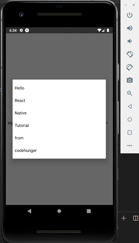
<Picker.Item label = "Hello" value = "1" />
<Picker.Item label = "React" value = "2" />
<Picker.Item label = "Native" value = "3" />
<Picker.Item label = "Tutorial" value = "4" />
<Picker.Item label = "from" value = "5" />
<Picker.Item label = "codehunger" value = "6" />
</Picker>
</View>
);
}
}
const styles = StyleSheet.create({
container: {
flex: 1,
justifyContent: 'center',
flexDirection: 'column'
},
text: {
fontSize: 20,
alignSelf: 'center',
}
});