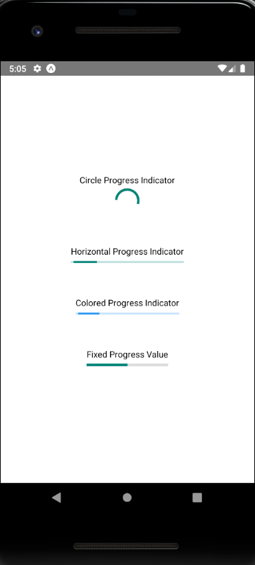
The ProgressBarAndroid component of React Native is used to indicate the progress status of some activity or app loading something. ProgressBarAndroid component works only on Android platform. To use the progress bar in iOS platform, a ProgressViewIOS component is used. Android-only React component used to indicate that the app is loading or there is some activity in the app.
| Props | Type | Required | Description |
|---|---|---|---|
| animating | bool | no | It is used to show or hide the progress bar. Its default value is true to show, (false to hide). |
| color | color | no | It sets the color of progress bar. |
| indeterminate | indeterminateType | no | It shows the intermediate progress status of progress bar. It can only be false if the styleAtte of progress bar is Horizontal. |
| progress | number | no | It is a progress value between 0 and 1. |
| styleAttr | enum | no | It sets the style of progress bar. There are various style of progress bar in React Native such as Horizontal, Normal (default), Small, Large, Inverse, SmallInverse, and LargeInverse. |
| testID | string | no | It is used to locate this view in end-to-end tests. |
import React from 'react';
import {View, StyleSheet, ProgressBarAndroid, Text} from 'react-native';

export default function App() {
  return (
    <View style={styles.container}>
      <View style={styles.example}>
        <Text>Circle Progress Indicator</Text>
        <ProgressBarAndroid />
      </View>
      <View style={styles.example}>
        <Text>Horizontal Progress Indicator</Text>
        <ProgressBarAndroid styleAttr="Horizontal" />
      </View>
      <View style={styles.example}>
        <Text>Colored Progress Indicator</Text>
        <ProgressBarAndroid styleAttr="Horizontal" color="#2196F3" />
      </View>
      <View style={styles.example}>
        <Text>Fixed Progress Value</Text>
        <ProgressBarAndroid
          styleAttr="Horizontal"
          indeterminate={false}
          progress={0.5}
        />
      </View>
    </View>
  );
}

const styles = StyleSheet.create({
  container: {
    flex: 1,
    justifyContent: 'center',
    alignItems: 'center',
  },
  example: {
    marginVertical: 24,
  },
});


